


What is Typography, and Why it Matters?
Typography refers to the art and technique of arranging type, including letters, numbers, and symbols, in a visually appealing and readable way. Typography encompasses everything from the choice of typeface to the spacing between letters, words, and lines, to the arrangement of text on a page or screen.
Typography is an essential aspect of design and communication. It can greatly influence the way people perceive and interpret written content. Good typography can make content easier to read, more engaging, and more memorable, while bad typography can make it difficult to read, unappealing, and forgettable.
Typography also plays a crucial role in branding and marketing. The choice of typeface, colors, and layout can help convey the personality, tone, and values of a brand and create a strong visual identity.
Types of Typography
Here are some of the commonly-used types of typography you should know:
- Serif: Serif fonts have small lines or flourish at the ends of the strokes that make up each letter. They are often used for body text in printed materials because they are considered more legible in smaller sizes. Examples of serif fonts include Times New Roman, Garamond, and Baskerville.
- Sans-serif: Sans-serif fonts do not have small lines or flourish at the ends of the strokes. They are often used for headlines, titles, and digital materials because they are considered more legible in larger sizes. Examples of sans-serif fonts include Arial, Helvetica, and Verdana.
- Display: Display fonts are designed for use in large sizes, such as headlines or titles. They often have unique or decorative features that make them stand out, but they can be difficult to read in smaller sizes. Examples of display fonts include Brush Script, Comic Sans, and Impact.
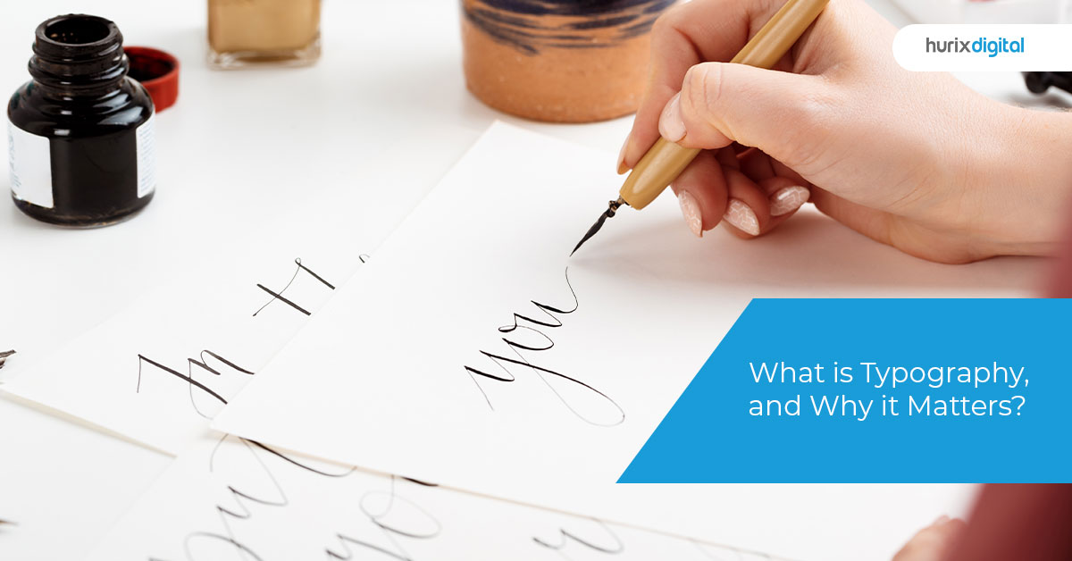
- Script: Script fonts are designed to mimic handwriting or calligraphy. They can be difficult to read at smaller sizes but are often used for invitations, greeting cards, and other decorative purposes. Examples of script fonts include Edwardian Script, Pacifico, and Lobster.
- Monospace: Monospace fonts have a fixed width for each character, meaning that each character takes up the same amount of space. They are often used in programming or coding environments because they make it easy to align text vertically. Examples of monospaced fonts include Courier New, Lucida Console, and Monaco.
- Decorative: Decorative fonts are designed to be eye-catching and visually appealing, but they can be difficult to read. They are often used for logos, branding, and other design elements. Examples of decorative fonts include Old English, Broadway, and Curlz MT.
Also Read: What is InDesign? Mastering InDesign Skills for Beginners
What is Typography in Graphic Design?
Typography is an essential part of graphic design that involves the arrangement and use of typefaces or fonts to convey information visually. It is the art and technique of arranging type in a way that makes written language legible, readable, and appealing when displayed. Typography in graphic design is used to communicate a message, convey a mood or feeling, establish hierarchy, and create a visual identity.
In graphic design, typography is used to create various design elements, including headlines, body text, captions, and logos. The choice of typography can significantly impact the overall look and feel of a design. Different fonts have different personalities, and the right font can set the tone for the design and help convey the intended message effectively.
Good typography in graphic design involves choosing the right font and typeface, setting the correct size, leading, tracking, and kerning, and arranging the text in a visually pleasing way. The proper use of typography can create a sense of balance, contrast, and hierarchy, making the design more readable and engaging. Overall, typography is an essential element of graphic design that helps communicate a message effectively and create a strong visual identity.
Importance of Typography
Typography is essential in design and communication, providing legibility, communication, branding, aesthetics, and accessibility benefits. The proper use of typography can make a significant difference in the effectiveness and impact of a design, making it more engaging, memorable, and accessible to a wider audience.
- Legibility: The primary function of typography is to make the text legible and easy to read. Clear and well-designed typography can make the content more accessible to readers, which is particularly important in printed materials, such as books, newspapers, and magazines.
- Communication: Typography helps communicate a message effectively. The right font, typeface, size, and spacing can enhance the tone, mood, and emphasis of the text, making it more engaging and memorable. Typography can also be used to establish a hierarchy of information, highlighting important points and organizing the content in a way that guides the reader through the text.
- Branding: Typography is a critical component of branding, particularly in logos, where it can help create a unique and recognizable visual identity. A distinctive typeface can help differentiate a brand from its competitors and convey its personality and values.
- Aesthetics: Good typography can enhance the aesthetic appeal of a design, making it more attractive and visually pleasing. Typography can add character and personality to a design, evoking emotions and creating a memorable experience for the reader.
- Accessibility: Typography can help make content accessible to people with visual impairments, such as dyslexia. The use of appropriate fonts, sizes, and spacing can improve readability and comprehension for people with reading difficulties.
Typography Design
Typography design is the process of creating effective and visually appealing typography for a wide range of design projects. It involves selecting the right fonts, typefaces, sizes, colors, and spacing to convey a message or create a specific mood or atmosphere.
- Font selection: Choosing the right font is a critical aspect of typography design. Different fonts have different personalities and convey different moods, and the right font can help reinforce the message of the design.
- Hierarchy: Hierarchy refers to the arrangement of text in a design, where more important information is given prominence over less important information. The correct use of typography can help establish a clear hierarchy of information in a design.
- Color: Color can be used to create contrast, highlight important information, and evoke emotions. Color can also help create a cohesive visual identity across different design elements.
- Contrast: Contrast is the difference between elements in a design. It can be used to create emphasis, highlight important information, and create visual interest.
- Layout: The layout of a design plays a crucial role in typography design. Proper spacing, alignment, and balance are essential in creating an effective and visually appealing design.
- Readability: Readability is the most critical aspect of typography design. The typography should be easy to read and understand, with appropriate spacing, leading, and kerning.
Typographic System
A typographic system is a set of rules and guidelines that govern the use of typography in a design. It provides a framework for creating a consistent and cohesive visual identity across different design elements, such as logos, websites, and printed materials. A typographic system helps designers organize the visual hierarchy of information and create a clear and intuitive user experience.
- Typeface selection: A typographic system typically includes a set of typefaces that are used consistently across all design elements. The typefaces should be selected based on their legibility, style, and compatibility with the brand or product.
- Hierarchy: The typographic system should establish a clear hierarchy of information, where more important information is given prominence over less important information. This can be achieved through the use of font size, weight, and color.
- Grids and layouts: Grids and layouts help designers organize the visual elements of a design, creating a consistent and visually appealing layout across different design elements.
- Color: Color is an important element of a typographic system. The system should define a color palette that is used consistently across all design elements.
- Spacing: Spacing refers to the distance between characters, lines, and paragraphs. The typographic system should define consistent spacing rules, such as leading and kerning, to ensure readability and visual appeal.
- Style guidelines: The typographic system should include a set of style guidelines that outline how the type should be used in different design contexts. This ensures consistency and reinforces the brand or product’s visual identity.
Conclusion
To conclude, typography design is the art of using type to create effective and visually appealing designs. The right use of typography can make a significant difference in the impact and effectiveness of a design, creating a memorable and engaging experience for the reader.

Ramprasath is the Project Manager – Operations (HPT-DCT). He is post graduate in computer science and has 8+ years of experience in Project Management and 18+ years of experience in Graphics Designing, Client Management, Resource Management, and managing the Offshore Books and Journals typesetting team. He is proficient in Adobe Creative Suite software, has knowledge of typography and color theory, and has expertise in E2E Project management services for Books and Journals.