


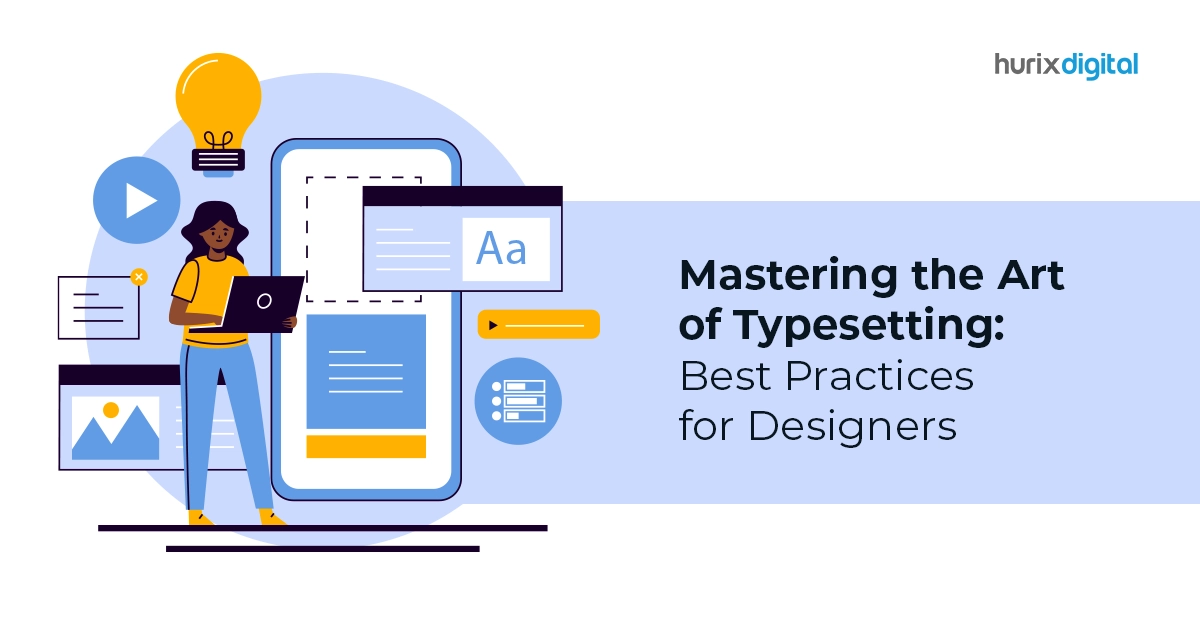
Mastering the Art of Typesetting: Best Practices for Designers
Typesetting, the art of arranging text elements, often takes a backseat in discussions of design. However, this seemingly technical craft holds immense power in shaping the visual impact, readability, and overall user experience of your design projects. After all, over 90% of the information present online is in text form and plays a pivotal role in shaping user experience.
From websites and brochures to packaging and presentations, mastering the art of typesetting unlocks your ability to create visually striking and user-friendly layouts.
We will go deeper into the world of typesetting, equipping designers with best practices, essential design principles, and practical tips.
Table of Contents:
- Understanding the Importance of Typesetting: More Than Just Aesthetics
- Design Principles for Effective Typesetting: A Foundation for Success
- Eight Practical Tips for Mastering Typesetting: Putting Theory into Practice
- Maintaining Consistency in Typesetting: The Key to Brand Cohesion
- Beyond the Basics: Exploring Advanced Techniques
- Key Takeaways
Understanding the Importance of Typesetting: More Than Just Aesthetics
34% of website visitors leave due to poorly designed and difficult-to-read layouts. While the visual appeal of design is undeniable, effective typesetting goes beyond mere aesthetics. It plays a crucial role in communication and user experience.
Well-considered typography ensures readability and comprehension, allowing users to effortlessly navigate and interact with your design. Conversely, poorly executed typesetting can hinder understanding, leading to confusion and frustration.
In essence, typesetting is the foundation upon which successful communication and user engagement are built.
Beyond aesthetics, effective typesetting plays a crucial role in:
- Enhancing Readability: Proper font selection, size, leading, and kerning ensure clear and effortless reading, improving user engagement and information comprehension.
- Establishing Visual Hierarchy: Strategic placement and manipulation of text elements guide the reader’s eye, directing attention to key information and creating a smooth visual flow.
- Reinforcing Brand Identity: Consistent and well-considered typography choices contribute to a cohesive brand image across various design elements.
Also Read: Cultural Influences on Typography: Global Perspectives in Typesetting
Design Principles for Effective Typesetting: A Foundation for Success
Effective typesetting rests upon a firm foundation of design principles. Typography mastery underpins the selection and application of appropriate typefaces, considering their characteristics and the message they convey.
Several key design principles form the bedrock of effective typesetting:
- Typography: Understanding the nuances of different fonts, their weight, style, and legibility is crucial.
- Hierarchy: Utilize contrasting sizes, weights, and colors to create a clear hierarchy of information, guiding the reader’s attention.
- Line Length and Spacing: Optimal line lengths and spacing ensure comfortable reading and prevent visual clutter.
- Alignment and Margin: Consistent alignment of text elements creates visual order and structure, enhancing readability and professionalism.
- Contrast: Striking a balance between text and background colors is essential for optimal legibility, especially in digital environments.
Understanding basic typographic anatomy, such as ascenders, descenders, and x-height, allows for balanced composition and avoids visual awkwardness.
Mastering fundamental principles like kerning and tracking ensures proper spacing between individual letters and entire characters, enhancing both readability and visual appeal.
8 Practical Tips for Mastering Typesetting: Putting Theory into Practice
The journey to mastering typesetting is a continuous exploration, so embrace the learning process and let your creativity flourish.
Now that you understand the principles, here are actionable tips to elevate your typesetting skills:
1. Start with Clarity
Define the purpose of your design and the message you want to convey. Choose fonts that are appropriate for your target audience and brand identity.
2. Understand Readability
Prioritize clear, easy-to-read fonts. Avoid tiny fonts or overly ornate styles that can hinder user experience.
3. Utilize Hierarchy
Implement contrasting sizes and weights to guide the reader’s eye through your design. Emphasize key information with larger fonts or bolding.
4. Mind the Line Length
Aim for line lengths that are comfortable for the reader’s eye. Avoid excessively long lines that can cause fatigue and hinder reading flow.
5. Embrace White Space
Don’t fear space! Utilize white space strategically to create visual breathing room and enhance the visual impact of your text elements.
6. Pay Attention to Alignment
Consistent alignment of text elements signifies professionalism and visual order. Ensure headlines, paragraphs, and bullet points are aligned for a polished look.
7. Harness the Power of Color
Utilize color strategically to create visual interest and reinforce hierarchy.
8. Proofread and Refine
Always proofread your text for any typos or grammatical errors. Make adjustments to spacing, kerning, and alignment for a polished final product.
Maintaining Consistency in Typesetting: The Key to Brand Cohesion
As you refine your typesetting skills, remember the importance of consistency. Establishing a typography style guide for your brand ensures that all communication materials, whether digital or printed, maintain cohesive and recognizable aesthetics.
This guide should define:
- Approved fonts: Specify the primary and secondary fonts to be used throughout your design projects.
- Font sizes and styles: Establish specific guidelines for various types of text elements, such as headings, body text, and captions.
- Color palette: Define the color palette for text elements, including primary and secondary text colors.
- Spacing and alignment: Dictate consistent spacing and alignment rules for various text elements.
Many design tools offer features like character styles and paragraph styles, allowing you to define and apply consistent formatting across your project.
Ensure your design adheres to the defined guidelines throughout, creating a unified and polished look.
Beyond the Basics: Exploring Advanced Techniques
As your skills evolve, delve into advanced techniques to further elevate your typography game.
The world of typesetting offers a vast array of techniques to explore. Consider venturing into:
1. Kerning and Tracking
Fine-tune the spacing between individual letters for a visually balanced and aesthetically pleasing look. Explore optical adjustments, fine-tuning letterforms for specific sizes and contexts.
2. OpenType Features
Utilize advanced features of certain fonts to create stylistic variations and add visual interest—master typographic ornaments and special characters, adding a touch of elegance and personality to your designs.
3. Grid Systems
Leverage grid-based layouts to establish a strong visual framework and enhance consistency across your design projects. Consider advanced layout techniques like baseline grids and golden ratio applications for enhanced visual harmony and balance.
4. Explore Additional Resources
Mastering the art of typesetting is an ongoing journey. As you gain experience and refine your skills, consider exploring additional resources, such as:
- Design blogs and tutorials focusing on typography best practices.
- Design professionals offer online courses and workshops.
- Design communities and forums for peer interaction and knowledge sharing.
Also Read: 10 Ways Your Website Can Leverage Dynamic Typesetting!
Key Takeaways
Effective typesetting is not just about aesthetics; it’s about communicating your design message clearly and effectively. By understanding the principles, mastering the techniques becomes easy and we simplify it for you.
Hurix Digital is a leading provider of typesetting solutions and services, specializing in curating visually engaging and impactful experiences.
Contact us to discover how we can help you integrate our knowledge to create layouts that are both functional and visually captivating.

Gokulnath B is the Associate Vice President – Editorial Services. He is PMP, CSM, and CPACC certified and has 20+ years of experience in Project Management, Delivery Management, and managing the Offshore Development Centre (ODC).