article thumbnail

6 Visual Design Tips to Make Your Course More Effective

LearnDash

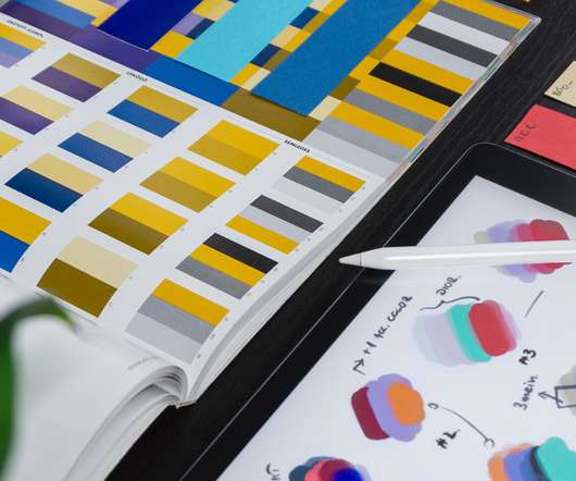
When information is presented clearly and organized well, it’s easier for learners to understand and remember it. However, a key aspect of good instructional design is how that material is presented, visually. Organize content so that it can be scanned in an E. Just as importantly, it’s worthwhile to invest in attractive images.

Design 306
article thumbnail

What Makes a Good Course, a GREAT Course?

Yukon Learning

How can we tap into the same vision you have when presenting content? ” Connect with Jolie on LinkedIn Kim (Consistent UI Elements) “ My goal is to create a visually organized, streamlined user experience that encourages visual scanning across the content and holds the learner’s attention.

Course 59
Insiders

Sign Up for our Newsletter

This site is protected by reCAPTCHA and the Google Privacy Policy and Terms of Service apply.

article thumbnail

Here’s an Easy Way to Create Free QR Codes for Your Courses

Rapid eLearning

They’re all over the place and scanning them with a phone is so easy. I know that when presenting in a classroom, it’s not always easy seeing the URL on the projection screen. Get your free PowerPoint templates and free graphics & stock images. With Covid-19, QR codes made a comeback. A QR removes this obstacle.

article thumbnail

The Challenge of Negative Organisational Perceptions of Training for Capability Building Programs

Acorn Labs

Take stock of if L&D’s current performance KPIs and objectives are truly aligned with the business. One tactic is continual environment scanning. This is intertwined with another hurdle when changing perceptions: Not estimating when L&D’s capabilities need improving, both in the present and future.

Metrics 52
article thumbnail

eLearning/mLearning: Easy Font Resources

The Logical Blog by IconLogic

Adding a touch of handwriting to learning presentations can help to convey playfulness, whimsy, or even formality, depending on the script font chosen. The obvious choice would be to use the stock script fonts found on most computers. This week I have a few easy resources for working with fonts.

Resources 159
article thumbnail

5 PowerPoint Design Tips That Wow!

DigitalChalk eLearning

Sometimes a PowerPoint presentation may be the majority of your course content. Stop creating those outdated presentations and impress your students with these 5 basic design tips. Break your text into bullets and spread it out throughout your presentation. Don’t cram so much text onto a slide. Use meaningful images.

article thumbnail

Common Visual Design Mistakes That Ruin the Way Your Course Looks

Rapid eLearning

Without a structured design, we tend to scan in a Z pattern. Or going a stock photo site and trying to come up with ideas. If everything on the screen looks equal it’s hard to scan the content and even more difficult to figure out what fits where. If you're interested in presenting at one of the roadshows, let me know.